

Can AI Agents and Paper Replace Figma?
A designer rebuilds two sections of his live site in real code, by voice. Some of it worked first try. Some broke on camera.
 The result
Can a code-native canvas replace Figma?
Done this kind of thing before? Trying it yourself.
Try it yourself
Redesign one section, your way
Here's the goal. Hand it to any AI coding agent and work it out. The steps below open on a hint if you get stuck.
- The goal
- Several directions for one section of your site, compared side by side, with the AI tells cut from the one you pick.
- Time
- About 15 minutes to try
I'm redesigning [a section of my site]. First, tell me whether this section should exist at all and what problem it solves for the visitor. Then look at how other products solve it and give me eight to ten genuinely different layout directions to compare side by side. List the tells of AI-generated design I should cut: unneeded eyebrow headers, near-identical font sizes, and icons louder than the copy.
Check your result
- You decided whether the section should exist before designing it
- You compared eight or more directions at once
- The one you picked has no unneeded eyebrow headers and only two or three font sizes
Step 1
Decide what deserves to exist
Stephen's testimonials section only fits three cards, and he has more to add. But his first question wasn't how they should look. It was whether a testimonials section should be on the page at all. The real problem is that visitors need social proof fast enough to trust his design services.

AI is closing the gap on spacing and type scale. Deciding what to build, and what not to, stays human.
Step 2
Research the pattern before you invent one
The three-card pattern has stopped scaling, so he looks for one that does. For an unrelated visual reference he pastes in a Mobbin screenshot mid-brief and asks the agent to try a version closer to it.
Another section, a services page that doesn't exist yet, gets the same treatment in a second chat, at the same time.
Step 3
You get out what you put in
He starts with the Paper Snapshot browser extension: select a section of the live site, or hold Command-Enter for the whole page, copy and paste into Paper. Paper's canvas is real HTML and CSS, so an AI agent can draw on it directly. "The canvas is the DOM."
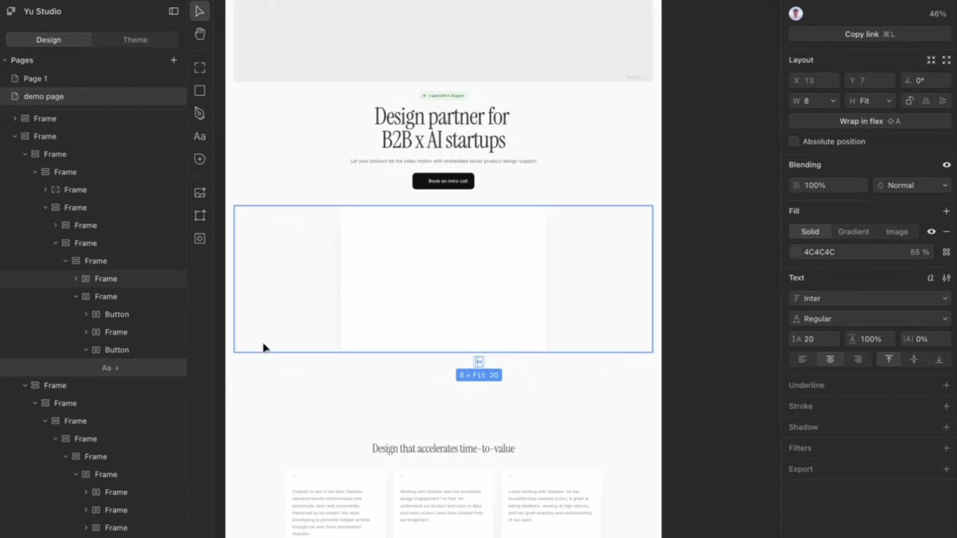
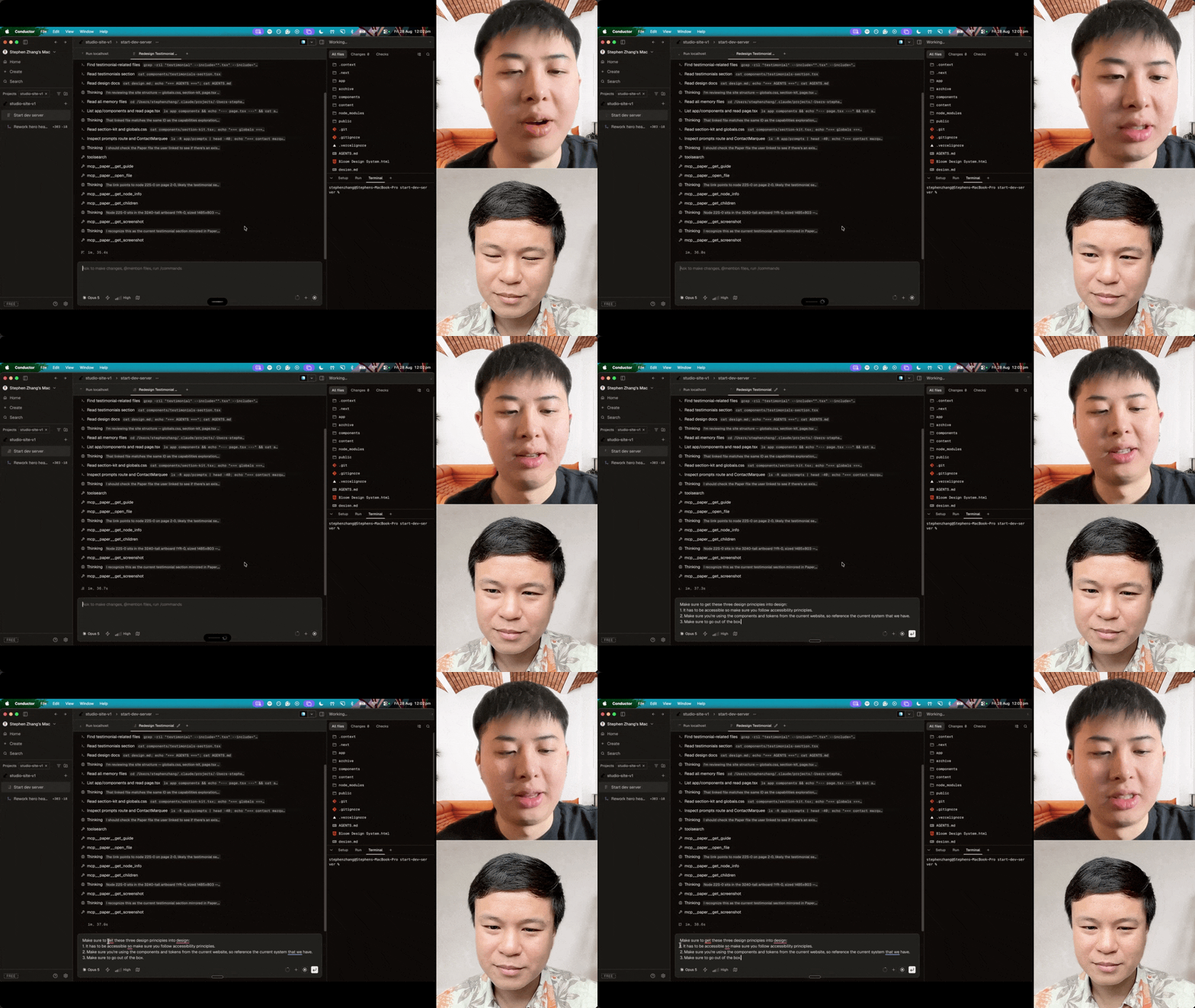
Then he links the frame in Conductor and briefs the agent entirely by voice with Wispr Flow: build a few more versions, the current one looks vibe-coded and only fits three, find a pattern that scales, bring some motion ideas, and generate eight versions to review.
Step 4
Generate ten directions and compare
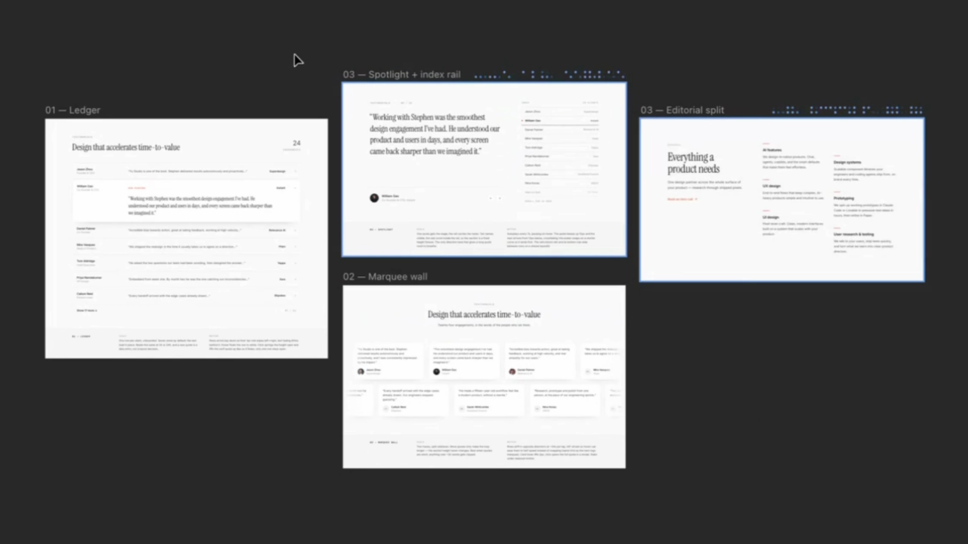
Eight directions come back onto the canvas. "Previously in code you would make one iteration. Now that it's in the canvas, I can take a step back and review all the ideas." The agent even pulled real client names and logos from the codebase instead of inventing placeholders.
Step 5
Learn the AI tells, then cut them
His read in one line: "AI adds things unnecessarily. It acts like an insecure designer." The tells: eyebrow headers on every section, five or six near-identical font sizes where two or three would do, and icons boxed and colored so heavily they outshout the copy.
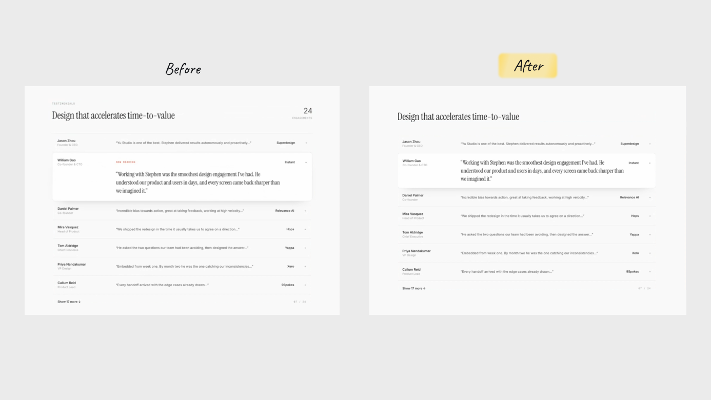
He deletes the eyebrows, strips the icons back to grayscale, aligns the text to one family and tightens the line-height.
Step 6
Spend craft on the 5% AI can't see
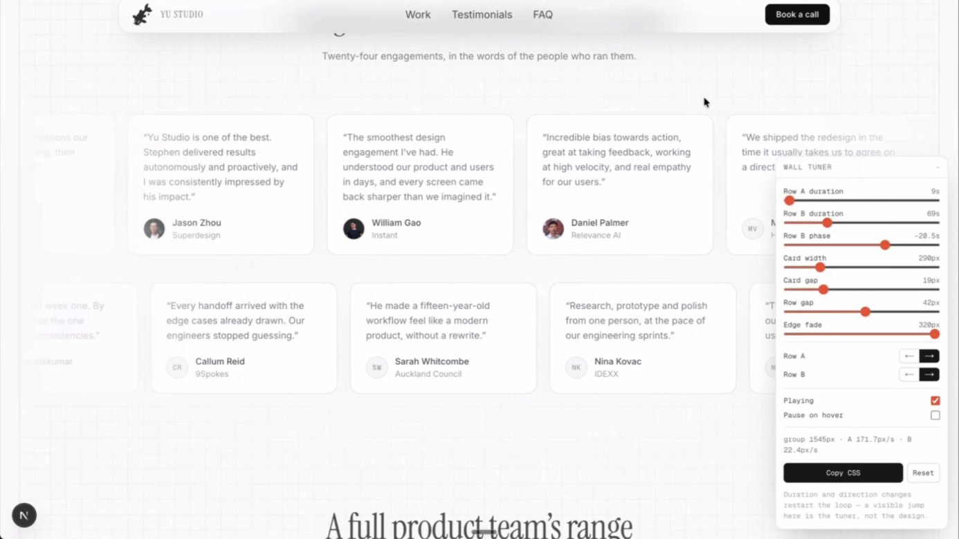
A static frame can't show speed or easing. So he asks the agent to build a one-off tuner: live sliders for row duration, card width, card gap, row gap, edge fade and direction. He drags until it feels right, then copies the CSS straight back to the agent.
Step 7
Design in the material you ship
With a direction he likes, he links the Paper frame, asks the agent to apply it to the live site, and because the frame is already code, "this process should be pretty quick, and also extremely accurate." The agent even added the hover behavior, where cards slow to a stop as you point at them, on its own.
Gut check
Which of these is a tell of AI-generated design?
Eyebrow headers, five or six near-identical font sizes and over-styled icons are the tells. "AI adds things unnecessarily." Cutting them back is the human pass.
Honest verdict
When to use it, and when not to
- Use it for
- Exploring eight to ten layouts on a canvas that is real HTML and CSS, then moving the chosen one into your codebase with a link. Especially useful if you are not a designer.
- Skip it for
- Expecting a clean 1:1 import. Snapshot got about 80% of his site and missed the video, the logo carousel and every scroll animation.
- Careful with
- AI layouts share the same tells every time. They still need a human pass.
Take it to work
Your Monday checklist
On your laptop 0 of 5 done
“Email this to myself” opens your own email app with a link back to this cheat sheet. Nothing is sent from this site.
Workflow done.
No streaks and no guilt. Come back whenever you have ten minutes.