
America.gov's New AI: 4 Lessons for Designers
I asked the government's new AI what to eat, four ways. Four very different answers. One is a template you can copy.
 The template
What does your AI say when it can't help?
Done this kind of thing before? Trying it yourself.
Try it yourself
Write the prompt sheet and the "no" for your own AI
Here's the goal. Hand it to Claude or any AI and work it out. The steps below open on a hint if you get stuck.
- The goal
- A two-column prompt sheet from your real data, and a four-part reply for something your AI can't do.
- Time
- About 10 minutes to draft
I'm designing an AI assistant for [my product]. Make me a two-column sheet. Column A: the 20 most common real questions, from [search logs, support tickets and call-center data]. Column B: how a stressed person would actually type each one. Then write the reply for a question my assistant can't answer: what it can't do, why, what it can do instead, and where to go.
Check your result
- Column B sounds like a stressed person, not a product manager
- The "no" says what you can't do and why
- It ends with what you can do instead and where to go
Step 1
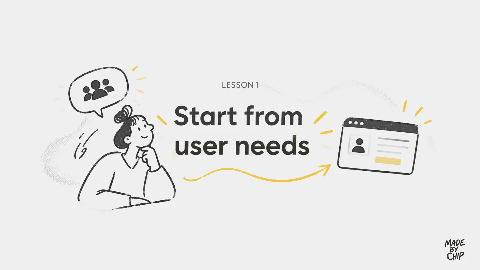
Start from user needs
America.gov puts a big prompt box on the landing page and cycles it through real situations: "I just got married, how do I change my name?" It starts from the citizen's pain point, not from a list of services. That teaches people how to ask, not just what to ask about.
USA.gov took the same route in its 2017 redesign, shifting from agency-centric to task-oriented, starting from search logs and call-center questions. For your own product, make a sheet:
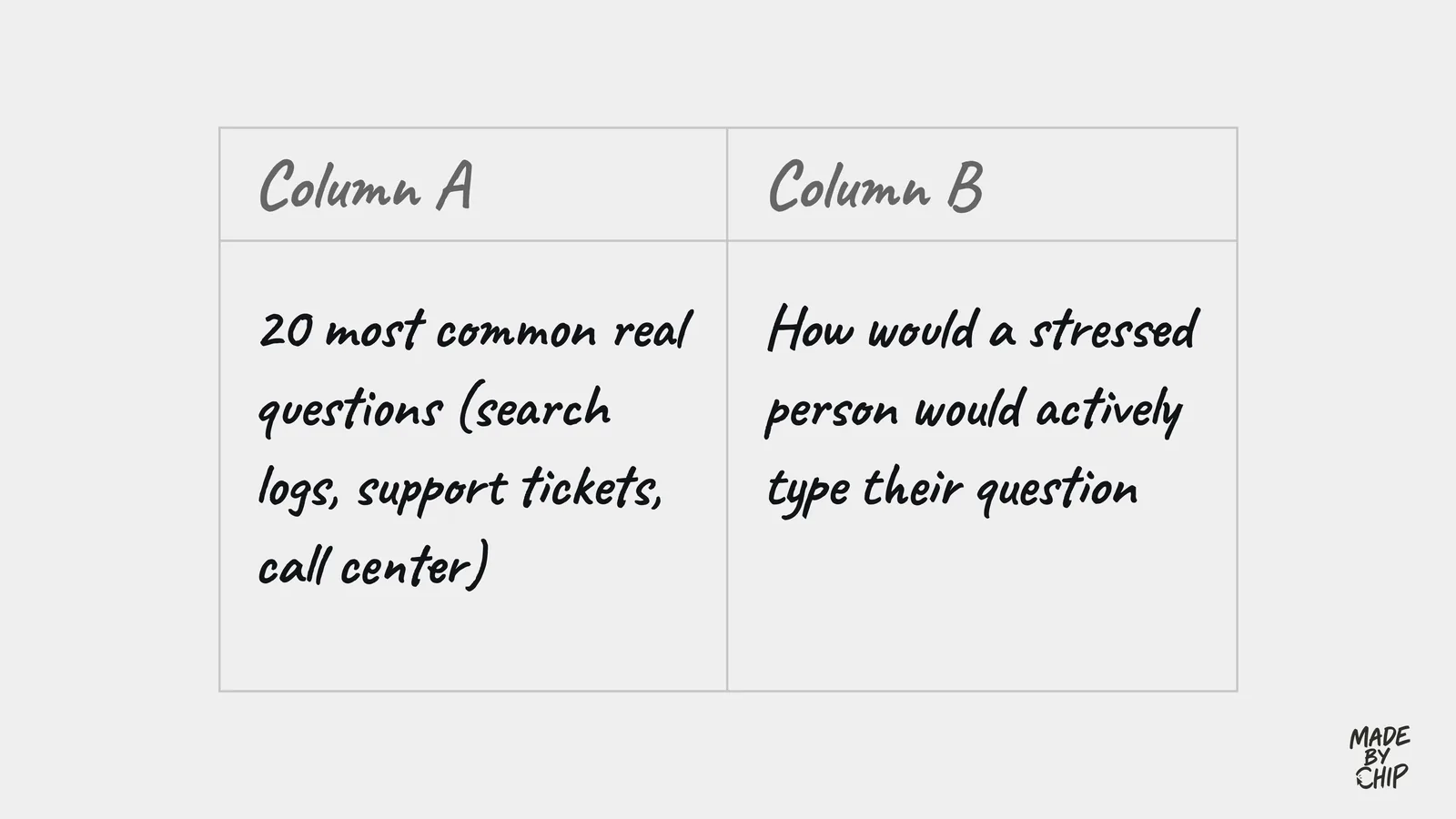
Then test your longest language, like German, and your narrowest screen. America.gov scrolls long prompts in a marquee so the cropped text stays readable.

Step 2
Trust that people can check
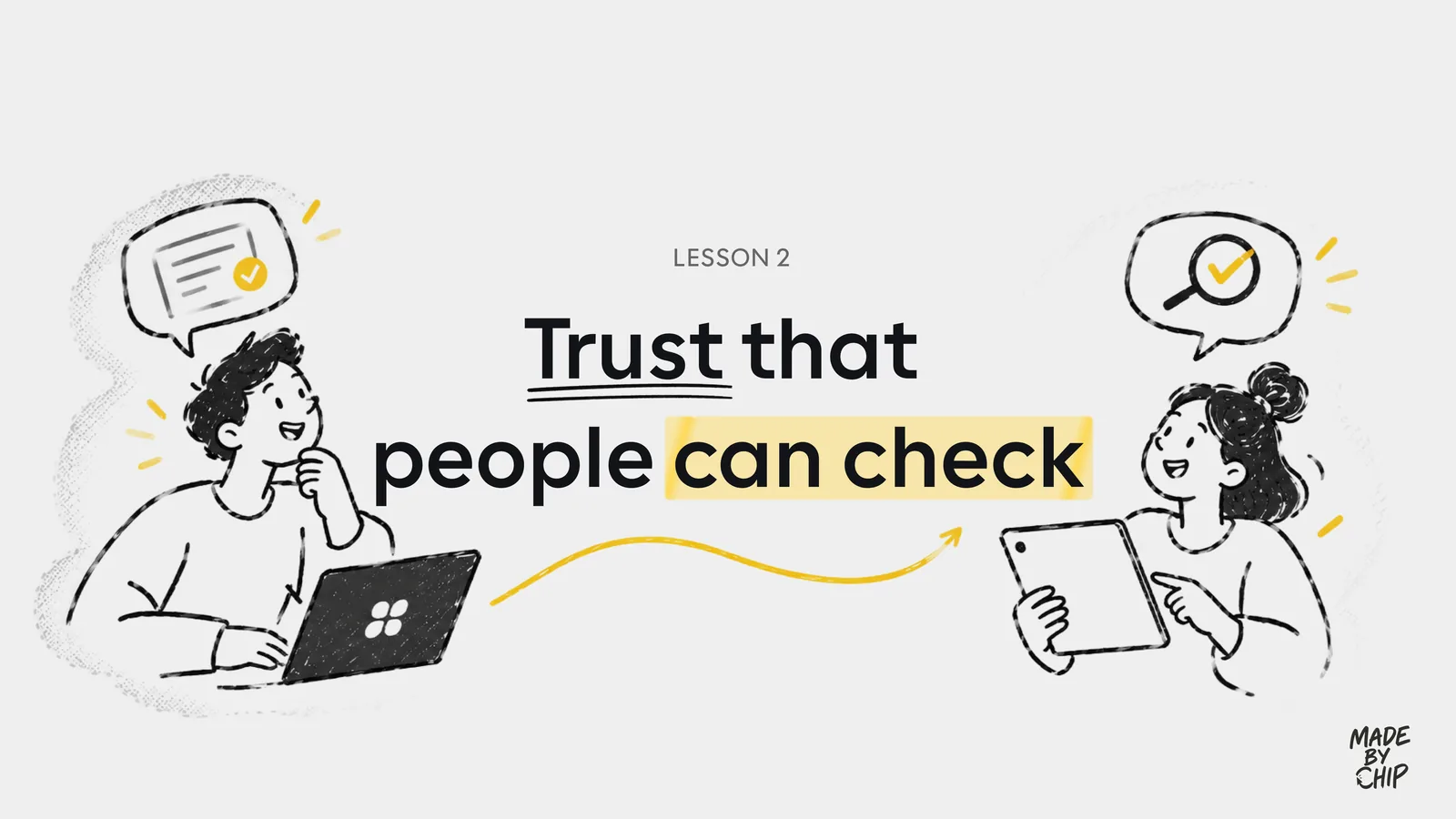
Tap Sources and America.gov lists the agencies behind the answer, with the article titles. For one query, CMS.gov alone listed eight articles. You can open them and cross-check the answer.
Next level: add a last-updated date. Then people can spot an outdated article, and fresher sources can rank higher.
Step 3
Test the edge case
I asked what to eat four ways. The first two got a one-line no. The third gave generic advice, with links I couldn't open. The fourth is the one to copy.
What I can't do → why → what I can do instead → where to go
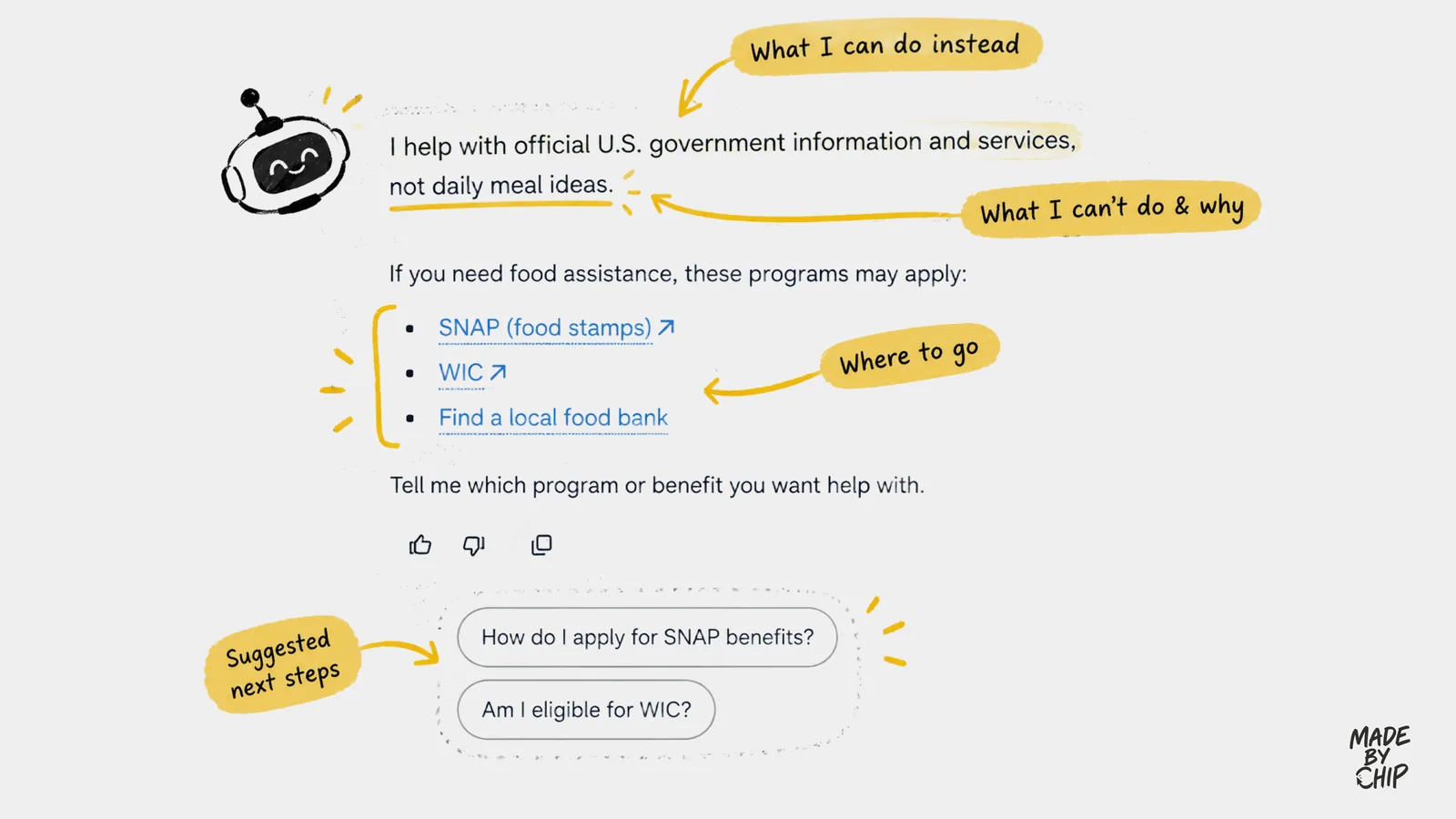
It said it helps with official U.S. government information and services (what it can do), not daily meal ideas (what it can't). It pointed to SNAP, WIC and finding a local food bank (where to go), with chips for next steps. A "no" that still gets you somewhere.
Phrasing changed the answer. Test your 50 hardest prompts, each a few ways, before and after launch.
Step 4
Make privacy part of the design
America.gov's privacy page promises no account, no tracking and no conversations kept. Some answers are cached for up to two hours, it uses an approximate location, and feedback is anonymous. And the product behaves that way: no login required.
Upload a PDF and it strips personal details in your browser first, using Rampart, an open-source classifier that detects things like Social Security numbers, phone numbers, emails and card numbers (per Lifehacker). The UI shows "Anonymizing" while it works.
Text PDFs only for now. An image receipt wasn't accepted. The privacy page is also a summary, so read the full policy for retention and logging details.
Step 5
Four ideas to take it further
My four ideas for America.gov, and any AI product that serves people through long, multi-step tasks.
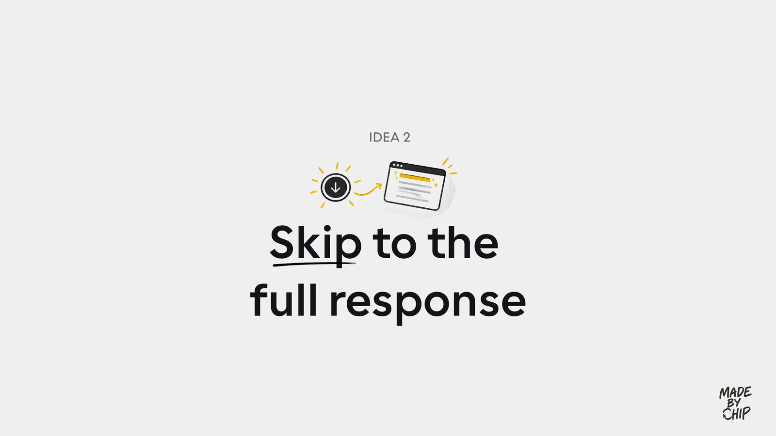
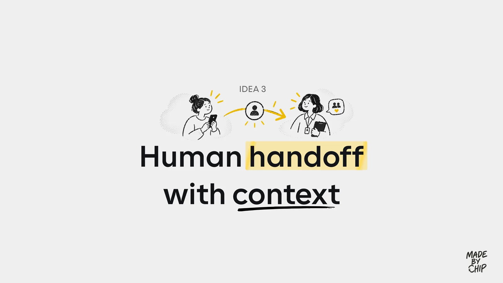
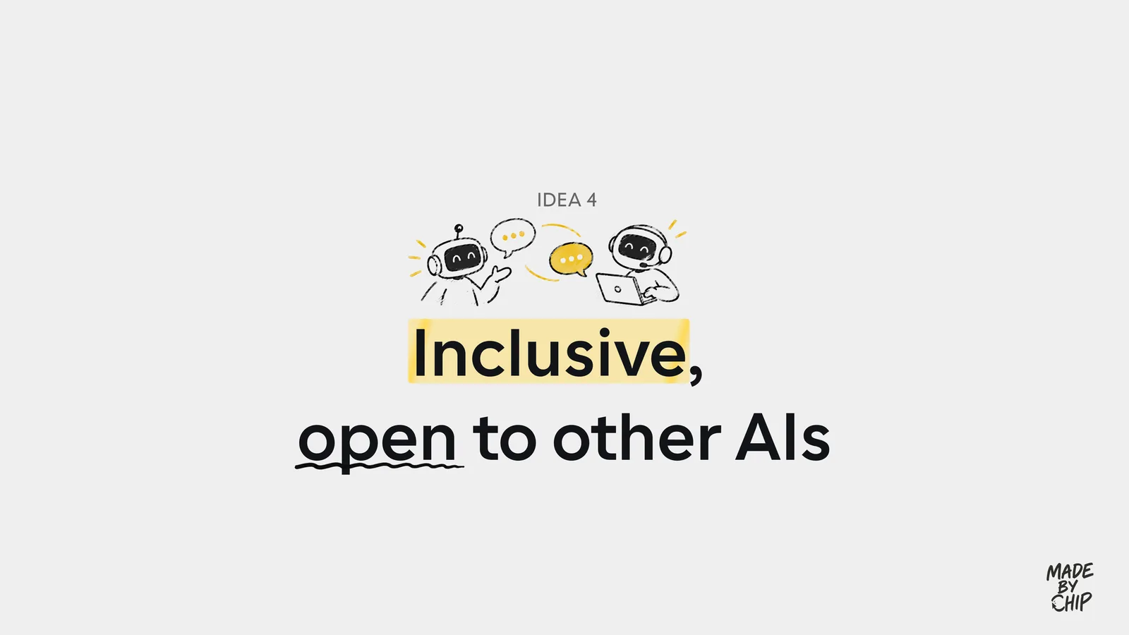
1. Build around life events, not services. One timeline across agencies, with reminders.
2. Let people skip to the full response. Long answers reveal slowly.
3. Human handoff with context. A short summary the person checks and opts in to send to a caseworker.
4. Inclusive by default. More languages, read-aloud, and open to people's own AI assistants through APIs or MCP.
Gut check
Your AI can't help with a question. What should the reply do?
The best of the four answers explained what the assistant is for, what it couldn't do, and then pointed to SNAP, WIC and food banks. A "no" that still gets you somewhere.
Honest verdict
What to take, and what not to
- Use it for
- Borrowing four patterns for your own AI product: a prompt library from real questions, visible sources, a four-part "no", and privacy that matches the policy.
- Skip it for
- Treating it as a final verdict. America.gov is new and still changing, and different phrasings gave me different answers, so what you see may not match mine.
- Careful with
- The privacy page is a summary. For retention and logging details, read the site's full privacy policy.
Take it to work
Four things to make this week
This week 0 of 4 done
“Email this to myself” opens your own email app with a link back to this cheat sheet. Nothing is sent from this site.
Workflow done.
No streaks and no guilt. Come back whenever you have ten minutes.