👋 TL;DR for Founders & Team Leads
Hey friends, Chip here. Everything in this article was built with text-to-lottie, an open-source skill for Claude Code and Codex, built by Doruk Kavcioglu (@dorukkavcioglu) and Konstantin Paulus (@konstipaulus), founders of Diffusion. Normally, motion design like this means opening After Effects, hand-keyframing every move, and eating up a large chunk of your computer’s resources along the way. With text-to-lottie, you describe the animation in plain English, and the agent generates the actual Lottie file—the same lightweight, JSON-based animation format most product and marketing teams already use for web and app motion. I built five different animations with it this week. Below is exactly what I typed, what broke, and what I did to fix it, so you can skip straight to the part you need or copy a prompt and run it yourself.
Revolver Clock
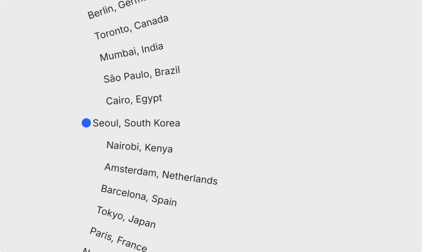
First up: a rotating clock hand sweeping through a list of city names, orbiting an off-screen pivot point.
I made a folder called text-to-lottie in my Documents, opened Terminal, went into that folder, and ran this:
Terminal
mkdir text-to-lottie && cd text-to-lottie
npx skills add diffusionstudio/lottie
Hit “y” to confirm, and it pulls the skill straight from Doruk’s GitHub repo. Then I opened Claude Code in the same folder and pasted in the prompt Doruk shared for this exact build. It was my first time using the tool, so I used his prompt close to verbatim before writing my own for the rest.
Konstantin's original prompt
Using the text-to-lottie skill, create a "revolver" / rotating-clock animation.

Composition: 512×512, background #EEEEF0, dark text #1A1A1E, accent #2F6BFF.

A small blue dot (~18px) sits at the far left, vertically centered (around x=30).

A vertical list of "City, Country" labels (~16 of them) orbits a SHARED pivot point that is far off-screen to the LEFT, with a virtual radius LARGER than the composition (~650px). So they move as one giant rigid wheel in a fixed shared coordinate system. Each label is oriented along its radius, so the label currently at the dot's height is perfectly horizontal and the others fan out — tilting more the further they are from the dot (rising to the right above, falling to the right below). Labels recycle/wrap off-screen so it's a SEAMLESS loop.

Motion: it ticks like a clock hand — ease forward by exactly one slot, briefly rest, repeat — but mostly-moving (~2/3 of each tick spent gliding, ~1/3 resting) with a soft easeInOut, so it reads as nearly continuous rather than a hard stutter.

Snap: while a label rests at the dot's height, nudge it a bit further LEFT toward the dot, then release it as it ticks away.

Expose live color controls for background, text, and dot.
Clicked “allow” a few times, and here’s what came back: the clock, working. One problem: the blue dot was covering the city names. I asked Claude to reposition it. That worked, but the dot wasn’t lined up with the text, so I sent a screenshot and asked it to center the dot against the city names. It came back exactly right.
Then I hit a real wall: I wanted this on a plain HTML page, and nothing showed up. Three things were going on. The Lottie file in the exported zip was named animations.json, so I renamed it to match my HTML. Then the page threw a CORS error, so I installed the Live Server extension in VS Code and clicked “Go Live.” The animation was still blank, so I asked Claude Code to investigate. Turns out lottie-web doesn’t embed fonts the way the preview player does. It expects the browser to already have the font installed. Adding an @font-face rule fixed it:
style.css
@font-face {
font-family: 'Inter';
src: url('./fonts/Inter-Regular.woff2') format('woff2');
font-weight: 400;
font-display: swap;
}
And, tada—it renders in the browser! You can skip all of that debugging: the finished HTML file is in the download below, fonts and CORS already fixed.
Get the fixed HTML starter + all 5 prompts
One zip: the CORS-proof, font-fixed HTML template, plus every prompt used in this article as a copy-paste file. Free.
Made By Chip Logo: 3 Versions
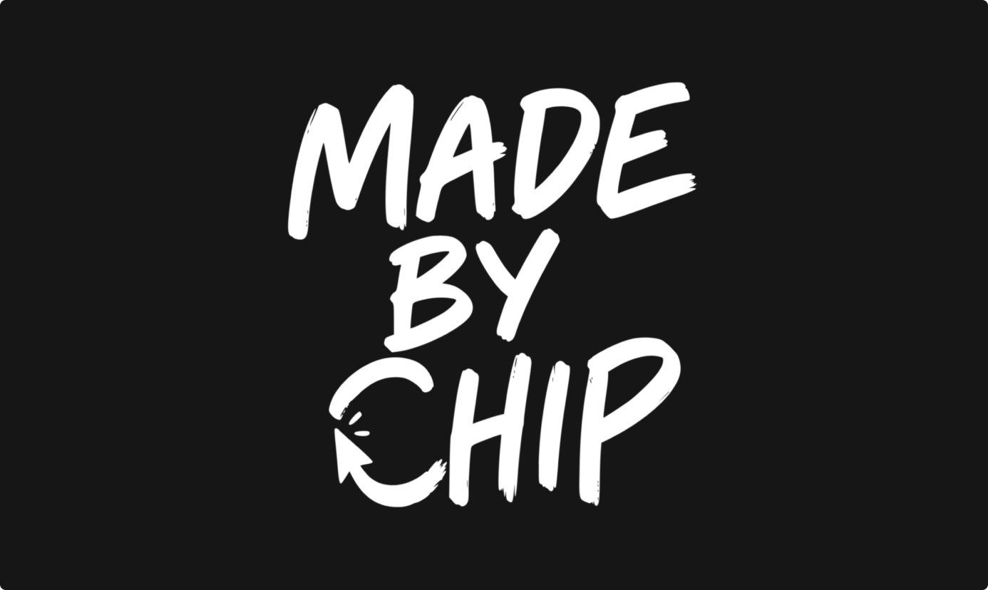
Next, my own logo (the mark you saw animate at the top of this page). I cropped each word, “Made,” “By,” and “Chip,” into separate SVGs in Figma first, so Claude could work from real path data instead of guessing at shapes.
Version 1: Spring bounce
Prompt
Reveal the words "Made", "By", and "Chip" one at a time, top
to bottom. Each word should scale up from 90% with a spring
overshoot — slightly past 100%, then settle. The moment "Chip"
lands, draw the circular arrow on with a write-on stroke
effect, tail to head. Finish with the whole logo doing a small
rotation snap to lock the reveal into place.
“Made” drops in first, then “By,” then “Chip”, each one bouncing slightly past its spot before settling. When “Chip” lands, the arrow draws itself on, tail to head. At the very end, the whole logo does a tiny rotation to lock in. That’s the animation running in the header above.
Version 2: Continuous paint stroke
Prompt
Same three words and arrow, but animate them as if the whole
logo is being painted in real time with a single continuous
stroke: "Made", then "By", then "Chip", then the arrow, using
a path-driven write-on mask with linear easing so the brush
speed never changes. Once the arrow finishes, pop the whole
logo up by 10% to land the reveal.
Looks like the logo is being painted live: one continuous stroke at a constant speed, ending with a small pop to land the reveal.
Version 3: Near-simultaneous
Prompt
Fade and scale in all three words together, staggered by only
a few frames, while the circular arrow rotates in from the
bottom-left with a slight overshoot before settling into place
under "Chip".
Everything lands almost at once: the words fade in together a few frames apart, while the arrow swings in from the bottom-left and settles under “Chip.” One fix across all three versions: the logo was getting cropped at the start of the frame, so I asked Claude to enlarge the canvas.
The part that actually impressed me: getting an AI agent to draw geometrically correct vector shapes (not approximate blobs) is a genuinely hard problem. Doruk solved it by having the agent read the real SVG path data directly, instead of guessing from a screenshot. His full write-up is worth reading if you want to go deeper on how that works.
Name Lower Third

Something more practical this time: a reusable lower third, the kind you’d use at the start of each new section in a video. I designed it in Figma and exported the SVG so Claude could match the layout exactly.
Prompt
Fade in "CHIP DONG" on the first line, then "LIM" on the
second line, all caps, first letter of each word slightly
larger, set in Inter Medium. As the letters appear, apply a
horizontal motion blur, like a camera catching fast movement.
After both lines land, fade in a black gradient overlay from
the bottom of the frame. Make the name text editable from the
side panel, not hardcoded.
“Chip Dong” fades in first, then “Lim” on the second line, with a horizontal motion blur as the letters appear, then a gradient fades in from the bottom. Two small refinements after the first pass: I wanted the text more legible, and the default speed felt a touch fast, so I asked Claude to add a shadow behind the text and let me adjust playback speed.
The side-panel editability is the detail that matters most here. This isn’t a one-off asset, it’s a template. Swapping in a different name for a different video is a text-field edit, not a rebuild. That’s the difference between a single output and a reusable production tool.
Don't Blink
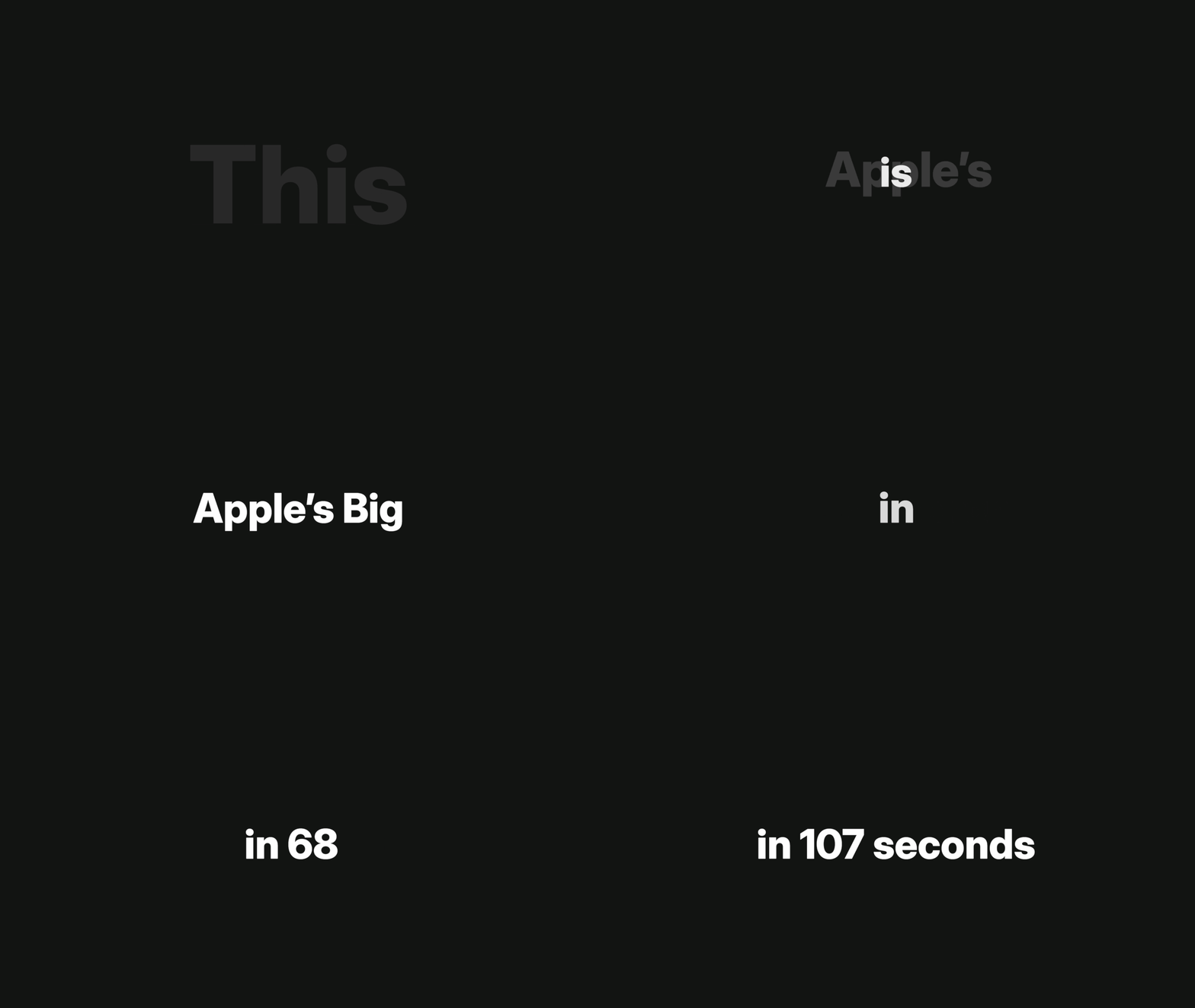
For the fourth build, I pushed further into full kinetic typography, the fast-cut text style the motion world calls “Stomp.” If it looks familiar, it’s directly inspired by Apple’s “Don’t Blink” commercial from nine years ago.
Prompt
Build a kinetic typography sequence: "This" slams in oversized,
then shrinks and fades out the instant "is" appears. "Apple's"
recenters when "Big" joins it, and recenters again when
"Launch" joins — the whole phrase should re-center every time a
new word is added, not just extend to one side. Animate a
number counter that rolls up rapidly like an odometer instead
of cutting straight to the final value. Have "sec" morph into
"seconds" using the same re-centering push, so the extra
letters appear to shove the rest of the line out of the way.
Use a hard, snappy ease-out throughout. Make every word
editable from the side panel.
Four techniques are doing the work here:
- Slam and vanish. “This” slams in huge, then shrinks and fades right as “is” pops in. Cheap trick, but the big word getting sucked away makes the small one feel like a punch.
- Constant recentering. “Apple’s” slides over when “Big” shows up, then slides again when “Launch” joins. The whole phrase re-centers every time, so your eyes stay in one place instead of chasing text around the frame.
- Odometer counter. The digits roll up fast instead of cutting straight to the final number. It sells urgency a hard cut can’t.
- Word morph. “Sec” stretches into “seconds,” pushing the rest of the line out of the way using that same recentering mechanic.
Two issues came up. First, “This” wasn’t actually centered, which was a straightforward fix. Second, when I swapped “Apple’s” for “text-to-lottie” to test the editable text, the spacing looked off. That’s not really a bug: Lottie can’t re-measure text at runtime, so a replacement word just sits in the old word’s fixed position. Worth knowing before you reuse a template like this with a much longer replacement word.
Brutalist Marquee
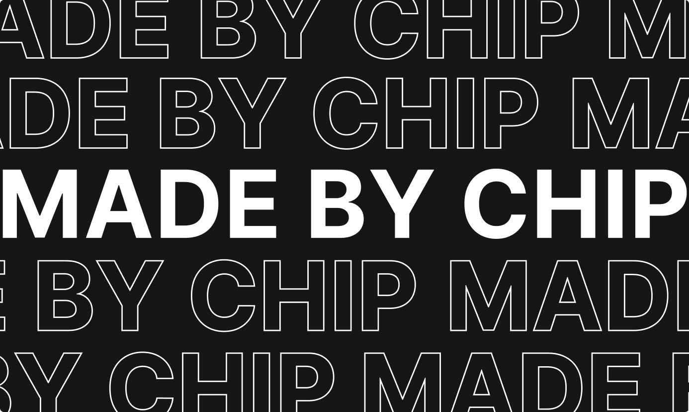
Last one. Less about a specific use case, more about testing what’s possible: filled and outlined text scrolling in two directions at once. I sketched the stages in Figma first and exported each as a reference SVG.
Prompt
Fade in solid white "MADE BY CHIP" centered on black with a
standard ease-in-out. Once settled, split it into two outlined
copies that move apart vertically — one up, one down — using a
snappy ease-out-back spring for a slight overshoot. A beat
later, repeat that split to add two more outlined rows at the
outer edges. Once all four outlined rows exist, turn them into
a continuous horizontal marquee: outer rows scroll one
direction, inner rows scroll the other, on strict linear easing
so the speed never wavers. Keep the solid center text perfectly
still throughout.
Two real bugs on this one. First, the outline text was missing the letter M entirely: my source SVG just didn’t have an M path in it. Re-exported from Figma after unioning the letter shapes, pointed Claude at the new file. Second, the A and P had a weird overlapping glitch. I asked Claude to use my outline SVG for the outline rows and plain Inter font for the solid center text. Both glitches gone.
What this changes about your design workflow
Replaces briefing a motion specialist or contractorfor templated, parameter-driven motion: logo reveals, lower-thirds, title cards, simple kinetic type. You no longer need someone fluent in After Effects' keyframe graph on the team to get this output.
Enables a generalist product or brand designer(junior or senior) to now ship work that used to require a dedicated motion hire or an agency retainer. Once a template exists and is editable, the next variant is a prompt, not a rebuild. Output per week goes up because the marginal cost of 'one more version' drops close to zero.
Doesn't replace original creative directionSomeone still decides that the four techniques in 'Don't Blink' are the right techniques. Judgment on where motion should or shouldn't be used at all. Complex character animation or broadcast-grade campaign work. This is templated, parameter-driven motion, not open-ended art direction.
A junior designer with this workflow can now ship at close to senior polish for this category of asset.The senior's remaining edge isn't whether they can execute the bounce. It's knowing when a bounce is the wrong choice.
Try it yourself
Everything you need to reproduce this:
- Install the skill:
npx skills add diffusionstudio/lottie - text-to-lottie on GitHub (skill source and docs)
- Doruk’s write-up on how the SVG path-reading approach works
My honest take: the templates aren’t always perfectly plug-and-play. The word-centering issue in “Don’t Blink” is a good example of where you’ll still nudge things by hand. But it saved a genuine amount of time. No masks, no keyframes, no app eating half my computer just to preview one change. And if I want different words later, it’s one prompt away.

Download every prompt + the fixed starter file
The exact five prompts from this article, plus the CORS-proof, font-fixed HTML template: one zip, free, delivered by email.
Frequently asked questions
No. The prompts describe the animation in plain English: composition, colors, motion, timing. The skill generates the Lottie file. Knowing what 'good' motion looks like when you see it is enough to direct and iterate on the result.
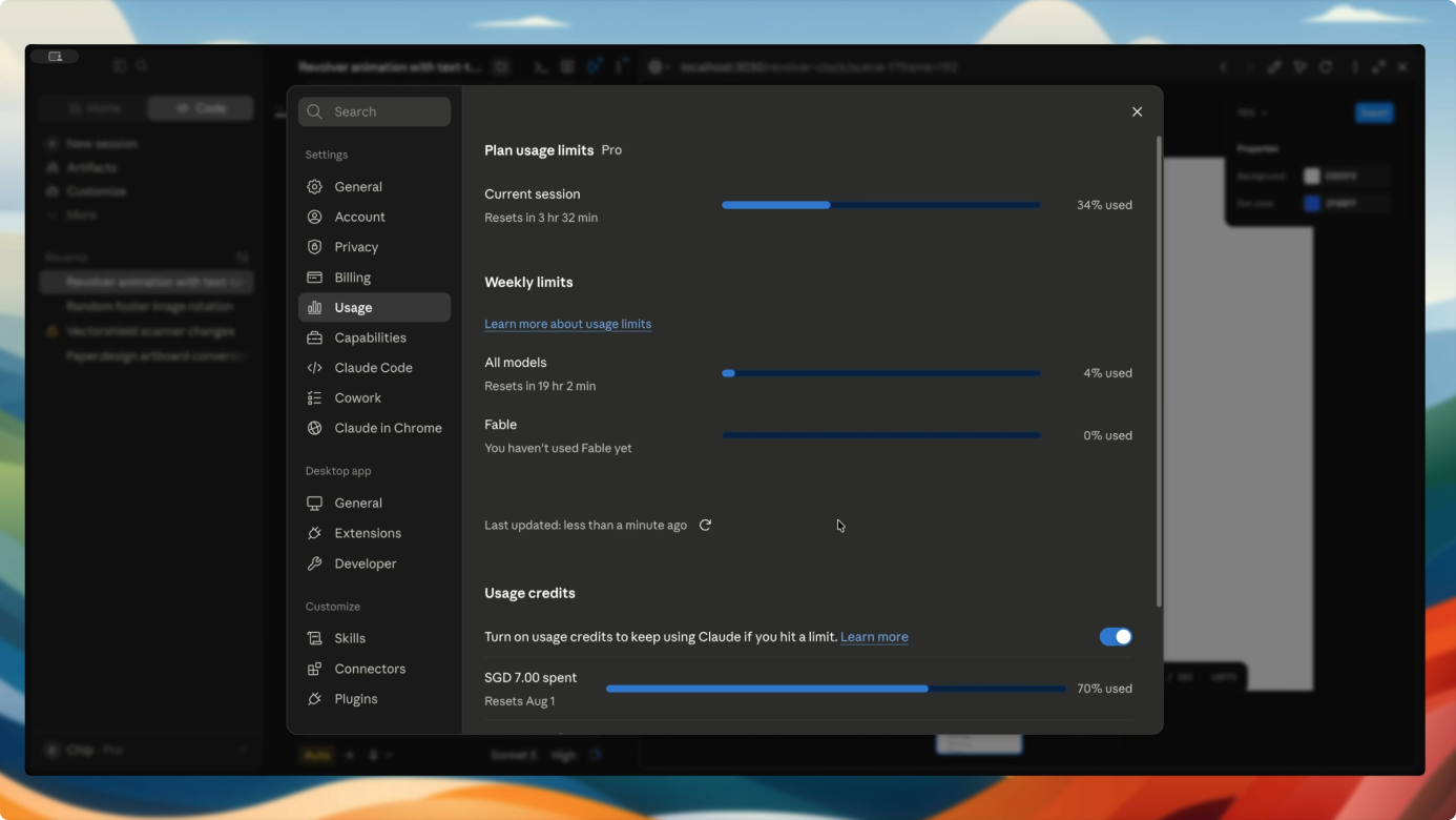
Five animations, start to finish, used a fraction of one Claude Pro session. No separate motion software license or contractor invoice.
No. It replaces templated, parameter-driven motion work. Original creative direction, judgment on when motion should be used at all, and complex or broadcast-grade animation still need a motion designer.
Both download boxes on this page send the CORS-proof, font-fixed HTML template plus every prompt used in this article to your email, free.
Workflow version: July 13, 2026. Tested with Claude Code (Claude Pro plan) and the text-to-lottie skill from Doruk / Diffusion. Renders confirmed in Chrome and Safari via lottie-web. This log will be updated as the skill changes—check the "modified" date at the top of this page.