
👋 TL;DR for Founders & Team Leads
This is a tutorial about building the tutorial page you’re reading right now. I wanted to know two things: how much of a Figma design can Claude actually translate into working HTML on its own, and where does a designer still need to step in. One afternoon, one artboard, one live page. Below is exactly what happened.
Before the Design
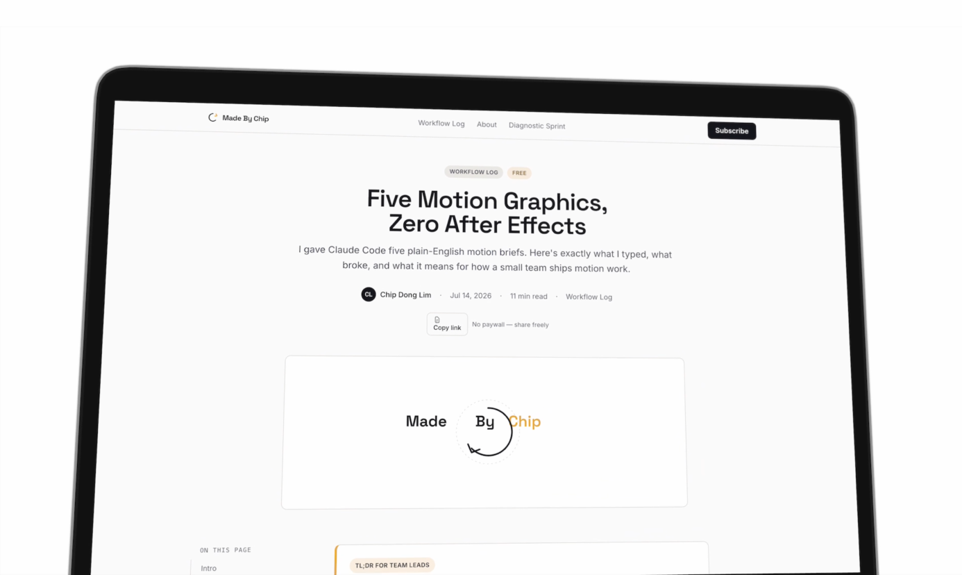
Before I touched Figma, I ran a quick test. I gave Claude a text description of what I wanted—a tutorial page template with a header, sidebar, article body, and a few interactive components—and let it generate a first pass with no design reference at all.
Here’s what came back.
The author info was all crammed on one row: name, published date, read time, category tag. All on the same line, same weight, same color. That doesn’t feel right. The social icons weren’t rendering. The logo was broken. And there was a TL;DR callout with a yellow left accent border that looked exactly like what you’d expect a language model to design—technically valid, visually generic.
On mobile, the chapter sidebar was sitting directly on top of the main content. Not overlapping at the edge. Covering it completely.
This is the baseline. It’s what you get when the design work hasn’t happened yet. Which is why the design work has to happen first.
So I opened Figma, designed the page properly, and then handed that design to Claude. Here’s what changed.
The Workflow
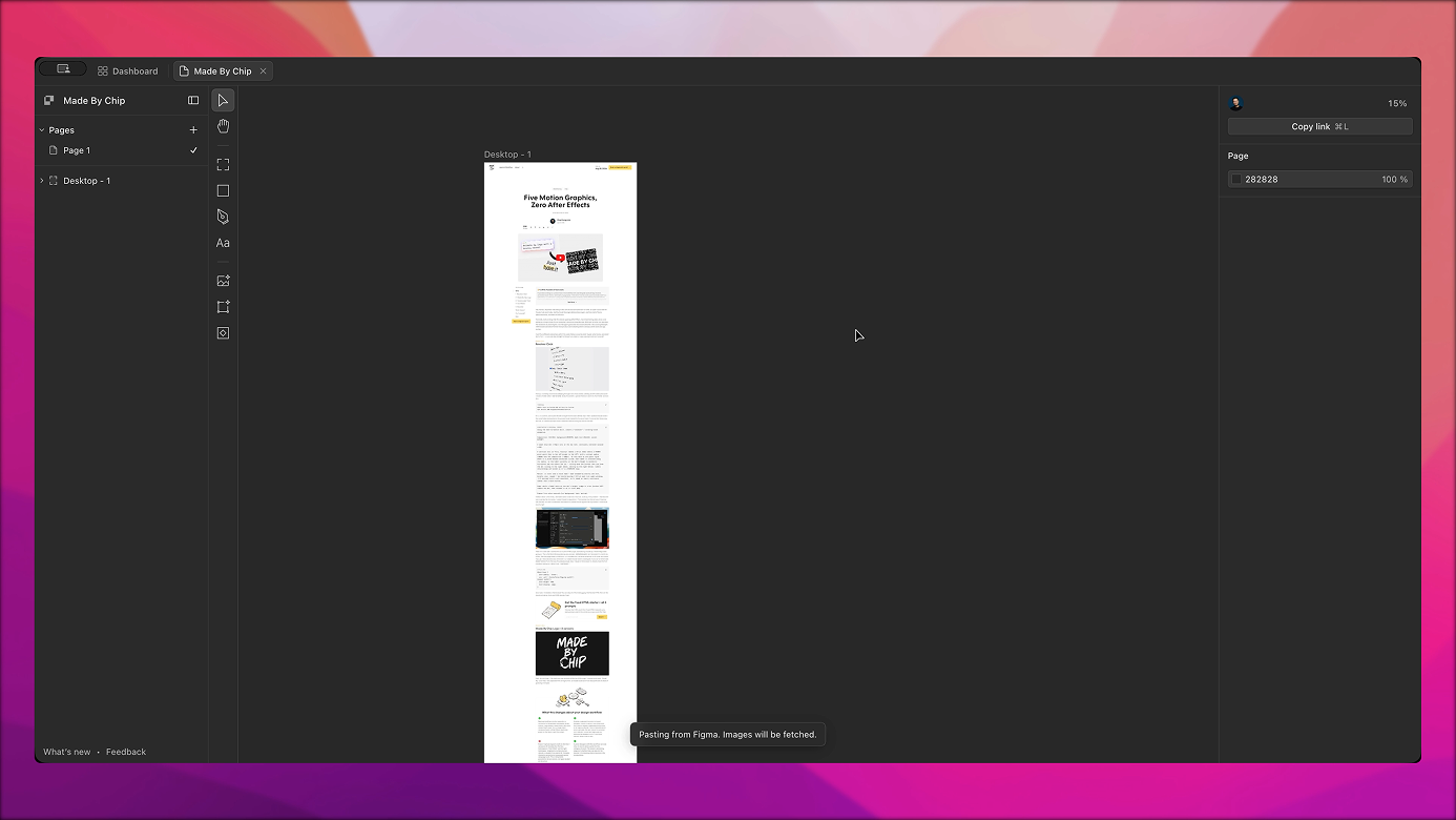
Quick context on the tools. Paper is a design tool—think Figma, but it runs a local MCP server in the background while your file is open. That server is the connection to Claude Code. You run /design-to-code from your terminal and Claude reaches into Paper, reads the current artboard, and gets the actual design structure: spacing, typography, tokens, layout. Not a screenshot. The real thing.
I designed in Figma first because that’s what I use, then exported the artboard into Paper.
Prompt
/paper-desktop:design-to-code
https://app.paper.design/file/01KXKCSYEAV7ZDQVHBB1Z4V3J5/1-0/CT-0
Convert the design to a HTML page.
Ensure it's mobile responsive. Use Cal Sans font as per the design.
Use ShadCN.
Claude asked upfront: React app or standalone HTML? I chose standalone—this was a new page, and I didn’t want it mixed into an existing project.
And it started building. It read the Paper artboard, pulled in the content and design tokens, and generated the page.
What Claude Got Right
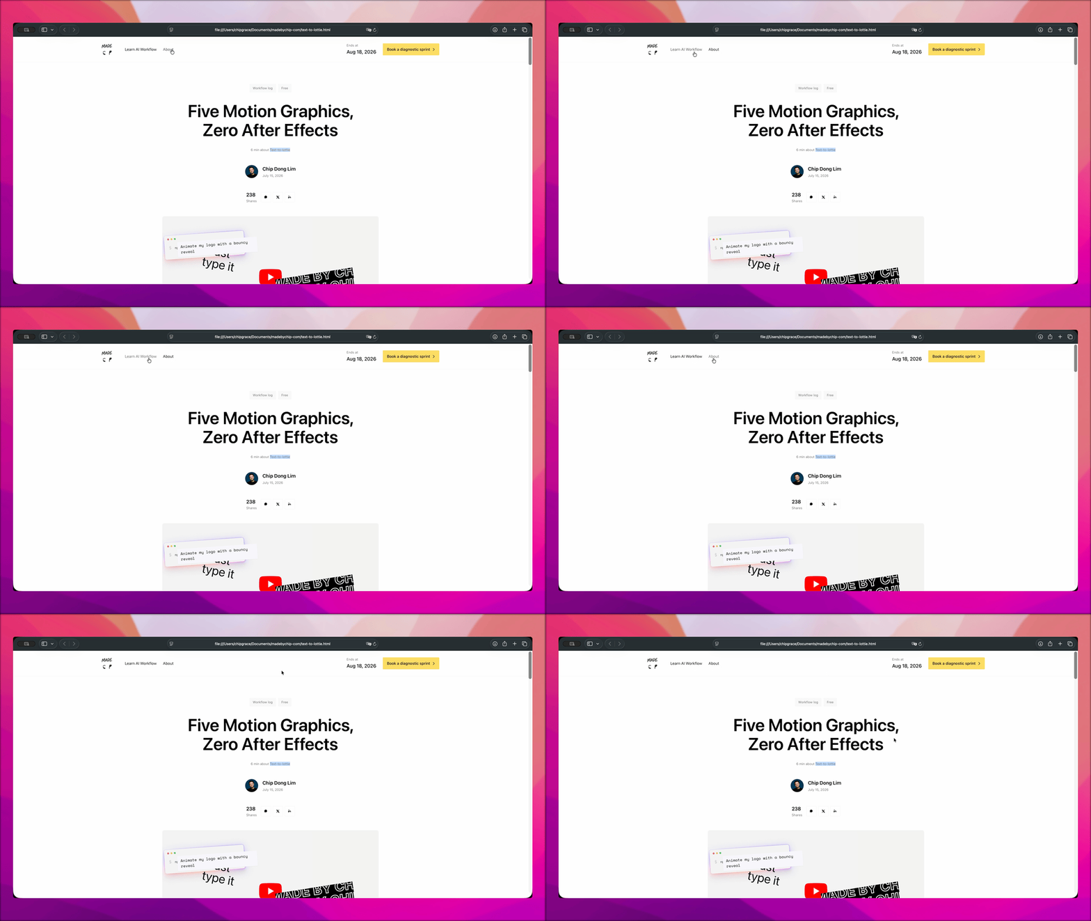
Some of this surprised me.
Nav hover states. I hovered on a menu item and the opacity changed. That interaction was not in my design spec. Claude translated it into working CSS on its own.
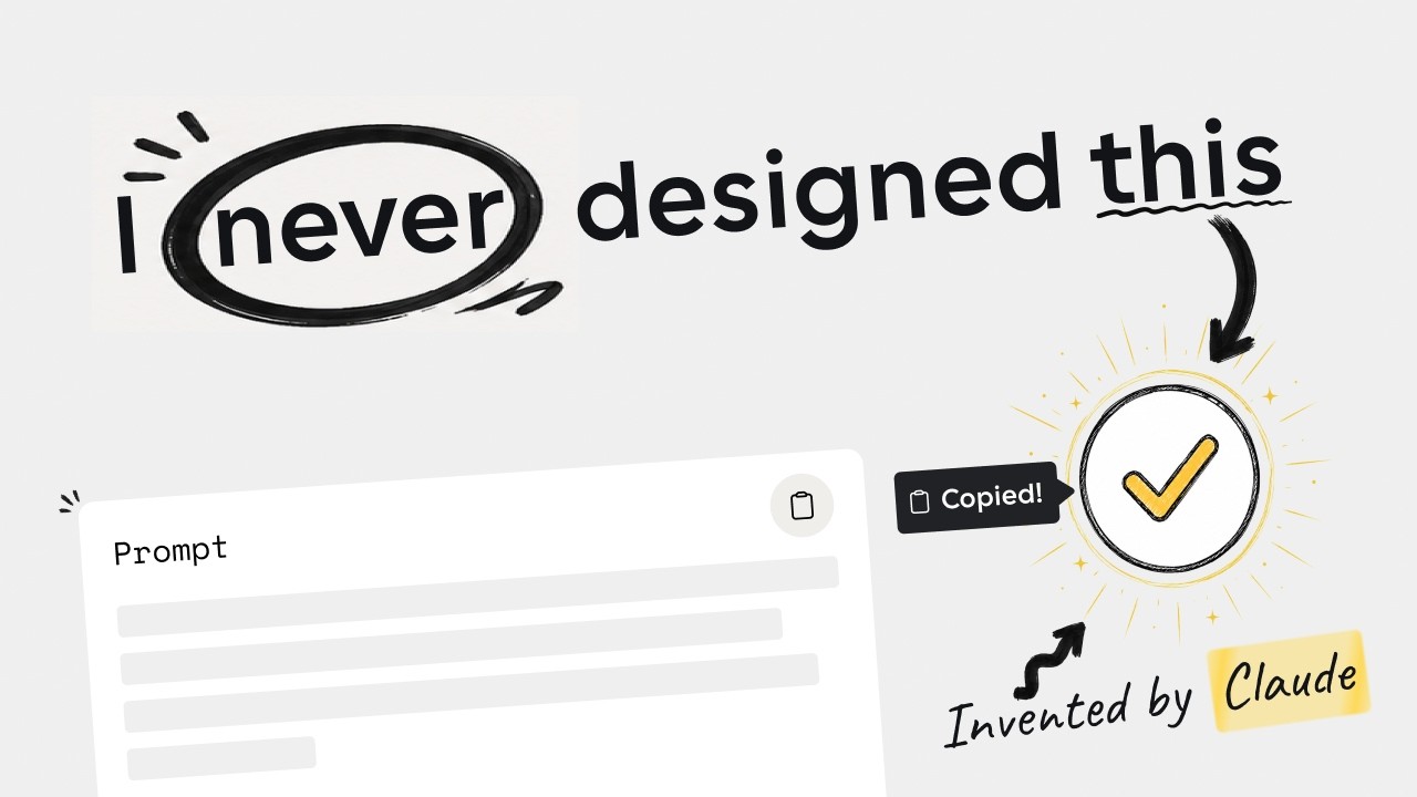
The copy button success state. I click the copy icon on a prompt block, and a check icon appears. That’s the success state—visual confirmation that the copy happened. The check was black at first; I prompted a fix:
Prompt
After user clicks on the Copy prompt icon clipboard-document, the "check" icon should be check from Heroicons, and color should be #24B822.
But the color isn’t the point. The point is I never designed that state. I had the copy icon in my design. Just the icon, sitting there. Claude inferred that clicking copy should confirm the copy happened, and built the whole before-and-after interaction itself, without being shown it.
In Figma, that’s a whole component: two states, linked, with the interaction wired up. Here it just appeared.
FAQ accordion. Expand, collapse. Works correctly. Not in the interaction spec.
Email input. Functions as a real text field.
Dark mode. I only designed light mode. Claude generated a complete, working dark mode on its own—correct colors, correct contrast, applied consistently across the whole page. That is an entire design deliverable I didn’t make.
Mobile layout. I never designed a mobile view. Claude translated the desktop layout into a usable mobile structure on its own.
These aren’t small things. Interaction states, responsive layout, and a full dark mode used to represent a significant chunk of the design and front-end work on a project like this. Claude filled them in from inference, not from spec.
What Needed My Eye
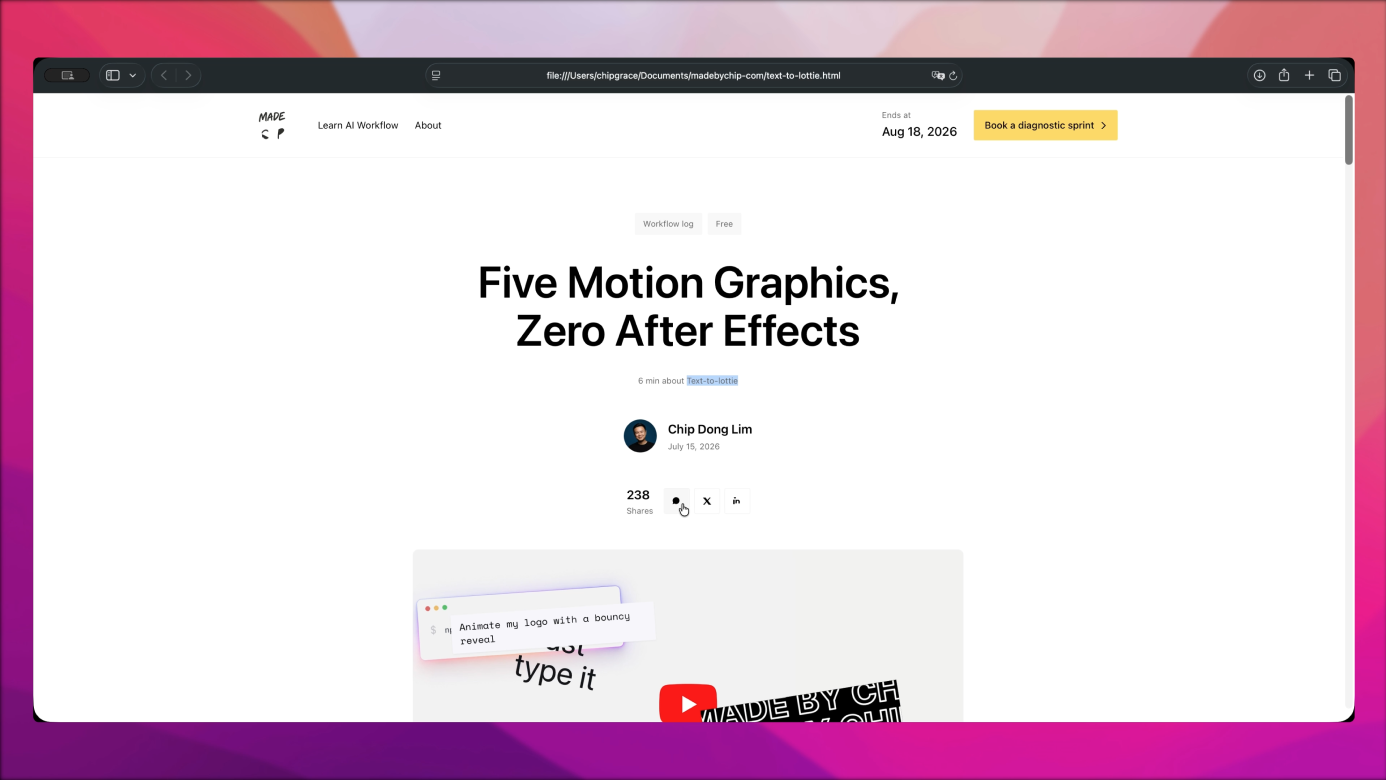
The assets were broken. The logo corrupted when the Figma artboard was exported to Paper. The social icons weren’t rendering. I exported the logo as an SVG locally, exported all the social media icons with clear names, and gave Claude one prompt naming the exact Heroicons icon for every state on the page:
Prompt
Please use Heroicons for the icons:

* sun and moon to toggle between dark and light mode.
* chevron-right for icon beside "Book a diagnostic sprint", "Send it", and the question in Frequently asked questions section when it's collapsed.
* chevron-down for icon beside "See more" and the question in Frequently asked questions section when it's expanded.
* clipboard-document for copy icon under terminal.
* check-circle solid and x-circle solid for "What this changes about your design workflow" section.

Please replace the current corrupted logo and social media SVG with the following icons in "Images" folder.
After that pass, everything rendered correctly.
Font weights. When you import a Figma artboard into Paper, font weights don’t always carry over. They got lost in translation—paragraphs that should have been semibold were rendering regular. Bullet points dropped entirely. I had to prompt Claude specifically to fix both.
Interaction timing. Every expand-and-collapse on the page—the TL;DR summary, the FAQ accordion, the long prompt blocks—used one easing curve for both opening and closing. It read as mechanical, not designed. I asked for two:
Prompt
Implement asymmetrical easing—meaning different animation curve for opening versus closing.

1. ease-out or a custom curve like cubic-bezier(0, 0, 0.2, 1) for Expanding (Opening), so it draws the user's eye smoothly into the newly revealed content without a jarring, abrupt stop.
2. ease-in or an acceleration curve like cubic-bezier(0.4, 0, 1, 1) for Collapsing (Closing), so the acceleration at the end of the animation makes the dismissal feel decisive.
One prompt, and it applied everywhere at once—every expandable block on the page shares the same toggle behavior under the hood, so a single instruction became a site-wide interaction fix. That’s a level of motion detail Claude won’t reach for on its own. It has to be asked.
Spacing system. One card’s padding looked disproportionately large. Rather than fix it in isolation, I asked Claude to check the whole page at once: “please align all the spacing in the page to a standard 8-point grid system.” Every margin and padding value on the page snapped to a consistent scale in one pass.
Portrait positioning. I wanted the author headshot sitting above the name, touching the top edge of the card below it—not floating in the middle. Claude’s first pass put it dead center.
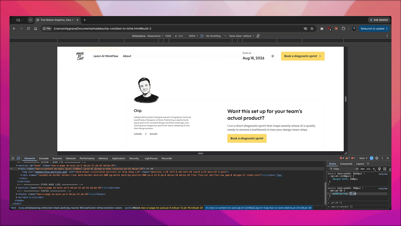
I re-prompted with a screenshot reference:
Prompt
For the "Want this set up for your team's actual product?" section, please update the image to "images/chip-portrait.png". The position is relative to the border box, which is above the title "Chip", as shown in the screenshot 1. Currently, it looks like screenshot 2, with the portrait sketch at the center.
Claude moved it, but the card’s padding hadn’t adjusted—the portrait was crowding the border. I opened the inspector, tested padding-top values live in the browser until 2rem looked right, then handed Claude the exact rule to change—along with a first pass that didn’t quite land:
Prompt
No, I actually want "chip-portrait.png" to be at padding-top: 2rem, as the head touches the border of the box. Please update the position of the image and content underneath it accordingly.
Three rounds of prompting for one layout detail—and none of it was me typing CSS. It was testing the value visually first, then describing precisely what I’d found. That’s the real workflow. Not one-shot generation. Iteration with a designer’s eye catching what the AI can’t see.
Centering. The sidebar and article content weren’t actually centered on the page—the right margin was visibly wider than the left. I drew two red border lines over a screenshot to show the gap, then had a hunch about the cause:
Prompt
Screenshot 1: The sidebar and article content is still not exactly at the center for the page. Notice when I drew two red border on the left and right, right side has more margins compared to the left—ideally they should be equal.

Screenshot 2: I might know why. Would it makes sense if the very left edge of both "Want this set up for your team's actual product?" and "Other popular work logs" sections are aligned to the chapter sidebar?
The hunch was right. Those two sections weren’t locked to the same grid column as the sidebar—once Claude aligned them, every edge on the page landed on the same line. Five elements, all at exactly 366.5px from center.
Get the HTML file + Figma template
One zip: The full HTML file converted from design, and the original Figma file. Free.
What This Means
The obvious takeaway is that this saved time. One afternoon for a fully responsive, animated HTML page that works in light and dark mode and handles its own interaction states. That’s real.
But the more interesting question is what the designer’s role actually is now.
My judgment mattered the whole way through. I had to know the crammed author row looked wrong—and go back to Figma and fix it before handing anything to Claude. I had to have an eye for illustration style, catch the font weight issue, and recognize when the portrait position was off by half a centimeter. None of that is automated. That’s design literacy.
But here’s what Claude did without being asked: I only designed light mode, and Claude generated dark mode entirely on its own. I never designed the copy interaction success state, and Claude built it anyway. The interaction spec layer—the part where you design the default, hover, active, and success states of every interactive element—used to live in Figma. Here, Claude just filled it in.
Which raises a question I don’t have a clean answer to yet: where does interaction design live now? In a prompt file? In a design token spec? In a markdown document that travels with the component?
If enough of you are thinking about this, I’ll do a follow-up on how to structure AI-ready design specs. Drop it in the comments.

Get the HTML file + Figma template
One zip: The full HTML file converted from design, and the original Figma file. Free.
What this changes about your design workflow
Dark mode generated without a dark designI only designed light mode. Claude inferred and built a complete, correct dark mode entirely on its own. That's an entire design deliverable that no longer needs to be mocked up.
Interaction states appear without being specifiedThe copy button success state, FAQ accordion, nav hover opacity—Claude built all of them without seeing them in the design. The interaction spec layer is quietly moving from Figma into the AI's inference.
Mobile responsiveness without a mobile artboardI never made a mobile design. Claude translated the desktop layout to a usable mobile view on its own. Designing mobile separately is still valuable—but it's no longer a prerequisite for getting a working mobile page.
Assets don't survive Paper import reliablyLogos, SVGs, and font weights can corrupt or drop when a Figma artboard moves to Paper. Budget for a dedicated asset-fixing pass before you hand anything to Claude. Export SVGs locally and name them clearly before prompting.
Layout precision still needs a designer's eyeCentering, portrait positioning, and spacing details required multiple rounds of prompting with screenshot references. The output gets close. Close enough to ship a rough is not close enough to ship a final.
Frequently asked questions
In this build, yes. I only designed light mode and Claude produced a complete dark mode on its own. Whether that consistently happens depends on your design tokens and how well the artboard communicates color intent. Don't count on it as a guarantee, but it's a meaningful upside when it works.
More than you'd expect for layout precision. The broad structure landed in one pass. Individual details—portrait positioning, centering, font weights—each needed two to three rounds, and the last round of portrait positioning needed a Figma screenshot reference before Claude understood what I meant. Budget for iteration, not one-shot generation.
Assets. The logo corrupted on Paper import. The social icons didn't render. Font weights dropped. These are consistent failure points whenever a design file moves through a pipeline—they're not unique to this workflow. Export your SVGs locally, name them clearly, and handle them as a dedicated prompt pass after the initial generation.
Figma has its own MCP integration. I haven't personally tested it so I can't compare them directly. The core workflow—design in Figma, connect to Claude Code, prompt the conversion—should transfer, but the specific /design-to-code command and token-reading behavior are specific to Paper's MCP setup.
Workflow version: July 20, 2026. Designed in Figma, exported to Paper. Built with Claude Code (Claude Pro plan) using the /design-to-code skill. Icons from Heroicons. Fonts: Cal Sans (local). Tested in Chrome and Safari, light and dark mode, desktop and mobile. This log reflects the state of the tools as of this build.