
👋 TL;DR for Founders & Team Leads
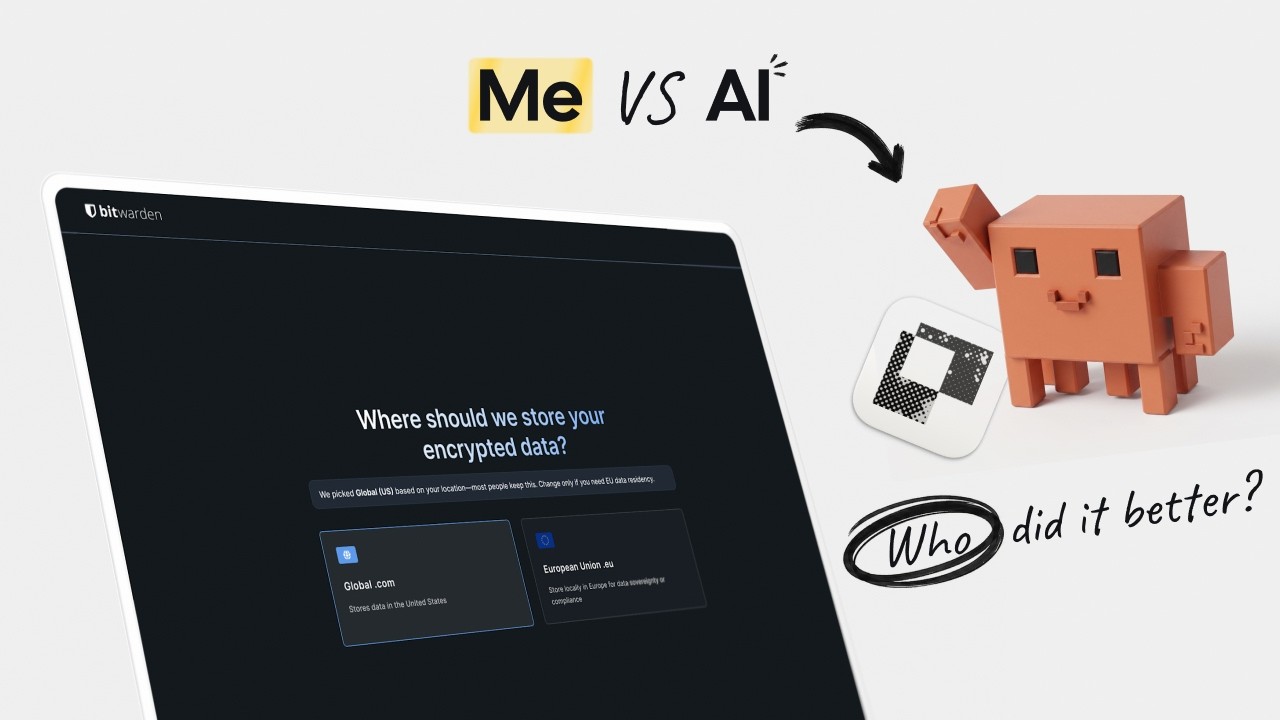
Bitwarden is a solid password manager. Its onboarding is not. So I redesigned the whole thing the normal way: research, wireframes, my own judgment, no shortcuts. Then I gave the identical brief to Claude, via a design tool called Paper, and let it take a run at the same problem. Same goals. Different designers. This is what happened.
What’s Broken
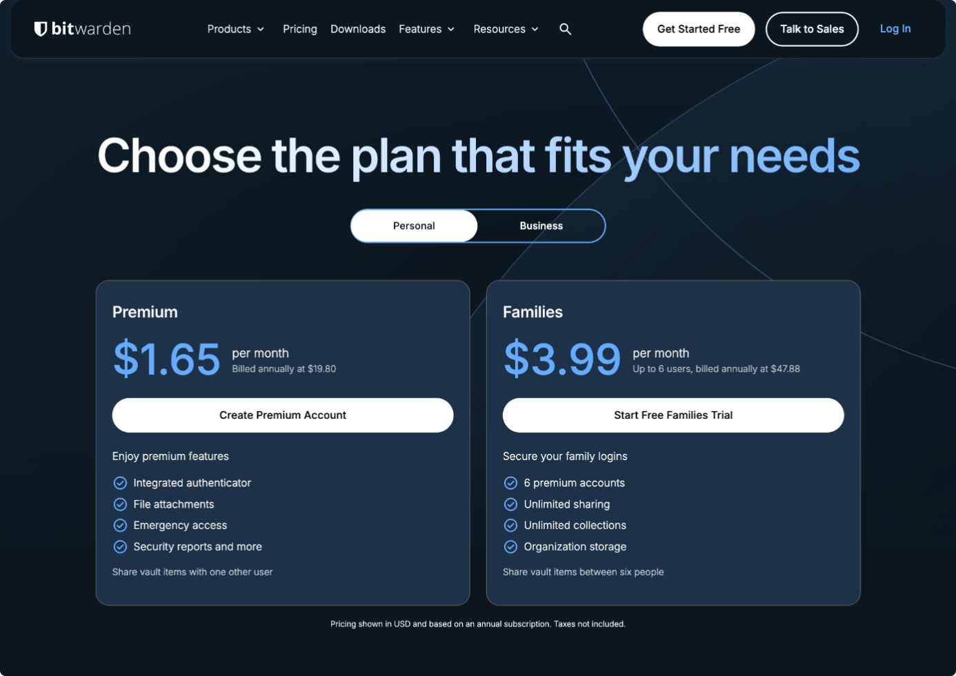
Click “Get started free” on Bitwarden’s homepage and you land on a pricing page. The Personal tab offers Premium and Families. The free plan you were promised isn’t visible. The biggest button says “Create Premium Account.”
The first thing a new user feels is a bait and switch.
You haven’t seen a single screen of the actual product yet, and you’re already doing math on annual billing across three tiers. Then the flow asks you to install the browser extension before you have any reason to want it. Installing an extension is a big lift: you leave the flow, go to the Chrome store, grant permissions, pin it to the toolbar. If you click “add it later,” it warns you that you won’t be able to autofill without it.
After that: a tooltip tour that tells you what to do instead of letting you do it, and an empty vault with a three-step checklist. Importing your passwords—the one thing that actually delivers value—is step two on that checklist. Left for you to figure out on your own, after the flow has already asked for everything else.
The whole flow is backwards. It asks for money, then trust, then commitment. And it saves the payoff for homework.
My Version
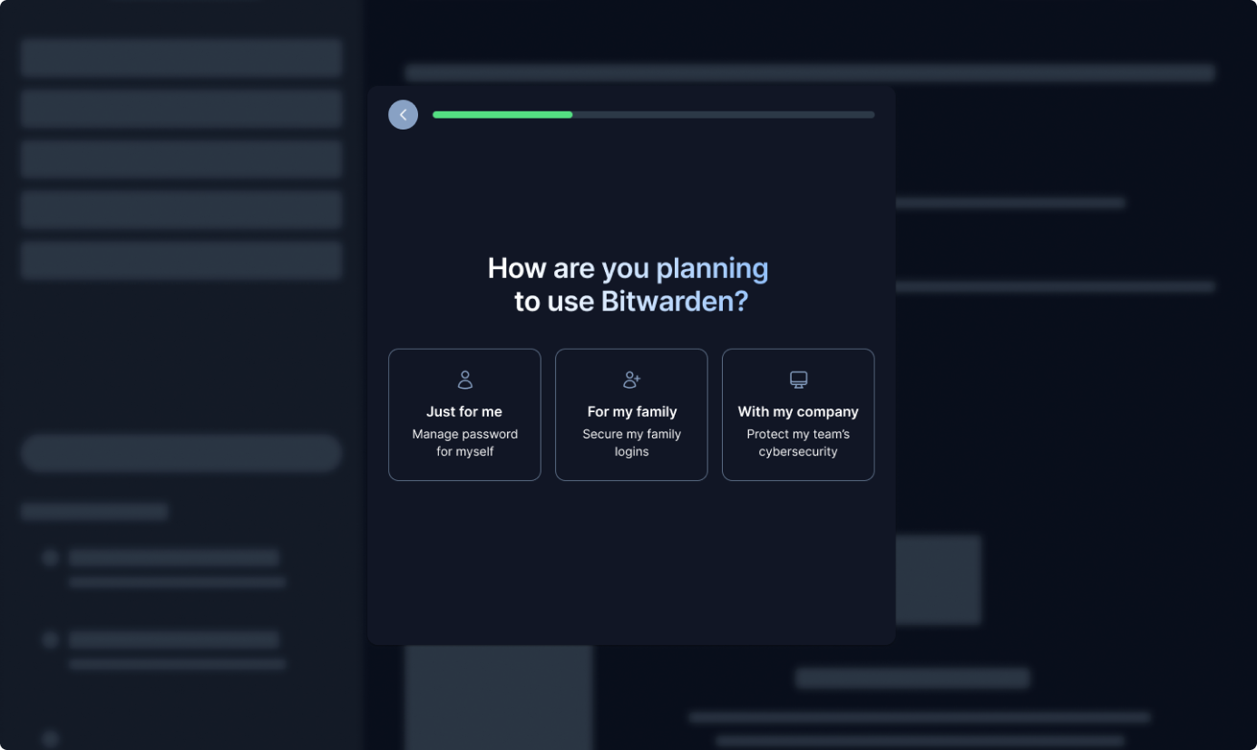
The first thing I cut was the pricing wall. Instead of “pick a plan,” I ask one question: how are you planning to use this? Just for me, for my family, or with my company. You’re not buying anything. You’re just telling me who you are.
Server region used to be a cramped radio button with no explanation. I replaced it with two cards that spell out the actual difference: both options are GDPR-compliant, one stores your data in the US, the other keeps it in the EU. No jargon, no guessing.
If it looks like you’re already using Chrome’s built-in password manager, I say so and tailor the next step around that, instead of making you figure out why this one is different.
Then the structural change that matters most: import comes before the extension. Importing your passwords is the moment you feel the value. The extension is the heavy lift. So I flipped the order.
I didn’t get everything right. I still made people verify their email before they could continue, a standard step I’d accepted as a given and never thought to question. Hold onto that. It comes back.
AI’s Three Directions
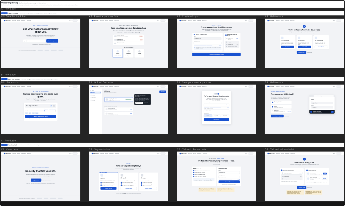
I dropped all nineteen original screens into Paper, connected Claude to it, and gave it the same goals I’d set for myself: lead with value, personalize early, cut the friction, show instead of tell, end with a habit.
A couple of minutes later, it came back with three fully-formed directions—not variations on one idea. Three genuinely different strategies.
Option A: The Value-First Story. It opens with a breach check. You type in your email, it shows you what hackers already know about you, and then it helps you fix it. The hook is fear.
Option B: The Do-It-Now Sandbox. A working password generator before you even make an account. Your time-to-value is basically zero. Then you sign up to keep what you made.
Option C: The Concierge Path. A quick “who are we protecting?” question that tailors the rest of the flow to whoever’s answering it.
The Call
Option A is a strong hook, but it’s a trap. Bitwarden’s entire pitch is privacy. Asking a total stranger to hand over their email so you can show them their breaches is invasive: you’re asking for trust before you’ve given them any reason to trust you. So, no.
Option B is genuinely good for regular consumers. But think about the IT director rolling Bitwarden out to five hundred people. He doesn’t want to generate a password on your homepage. He wants compliance, audit logs, and admin controls. Option B is a great landing page for a different campaign. It’s not the front door.
Option C is the one. It’s the only direction that works for both ends of the market without alienating either. One low-pressure question, and everyone ends up in the right place.
And here’s where AI caught me. It pushed back on email verification: don’t block people there. Let them set their master password first, and verify whenever they want. I’d accepted email-gating as a required step without ever questioning it. The AI questioned it. That was right.
But here’s what it missed—what my first draft missed too. I’d split users into “just me,” “my family,” and “my company.” The problem is a freelancer or a solopreneur: someone who runs a business alone. “My company” sounds like teams, SSO, and a five-seat minimum they’ll never touch. There’s a whole segment with nowhere to land. The AI never caught it. I added a fourth path—Solo Business—for exactly those people.
The Result
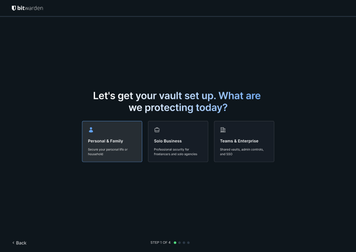
The rebuilt flow starts with four cards: just me, my family, solo business, or my company. You’re not buying anything yet. You’re just telling me who you are, so the rest of the flow can fit.
The plan screen became two columns: recommended plan on the left, sign-up on the right. We learn who you are before we ask for your email.
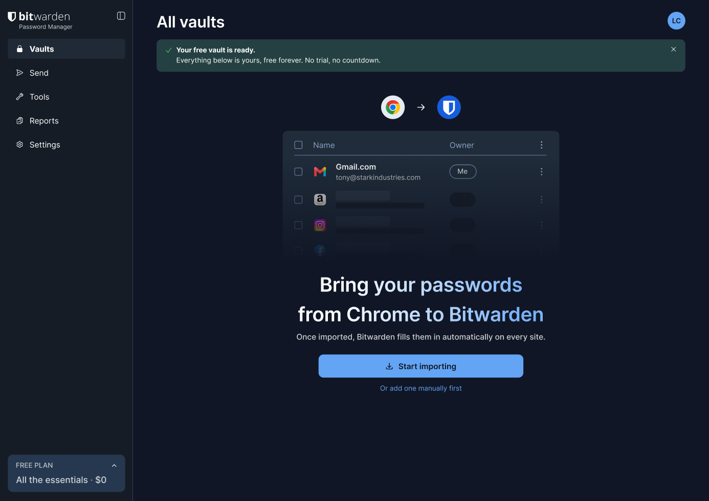
My favorite detail is the import step. You click “Start importing” and Chrome’s export page opens in a new tab. By the time you switch back, the screen has already changed—it’s a drop zone now, waiting for the file you just downloaded. It picks up right where you left off.
The payoff is immediate. The second your passwords come in, Bitwarden shows you which ones are weak or reused, flagged and ready to fix. You didn’t just move your passwords over. You just found out which ones were putting you at risk. That’s value you can actually see.
Now, finally, we bring up the extension. You’ve felt the payoff, so the big ask makes sense. Install it, and from then on every login just happens. That’s the habit.
Get the full prototype + design notes
Interactive Figma prototype and the complete design rationale behind every screen. Free.
Who Won?
Neither. And that’s the point.
AI handed me three strong directions in a couple of minutes and caught at least one thing I’d left too rigid. That’s genuinely useful—not as a replacement for thinking, but as a forcing function. A way to pressure-test your instincts before you’ve spent three days on wireframes.
But it couldn’t tell me which of those directions actually fit a product that has to serve both a family and a five-hundred-person enterprise. It didn’t catch the freelancer who’s a business of one. And it didn’t know to hold the extension back until people had actually felt what Bitwarden does for them. Every one of those calls required knowing the market, the brand’s implicit rules, and the real shape of the user base, not just the brief.
AI will generate three good ideas before lunch. Generating ideas and picking the right one are two different jobs. The designer is still the editor.
So if you take one thing away, take these five questions. I kept asking them at every screen:
- Lead with value: does this screen earn its place by giving something?
- Personalize early: do we know who we’re talking to before we shape the flow around them?
- Cut friction: is every step actually necessary, or have we just accepted it?
- Show, don’t tell: does the user feel the value, or are we just describing it?
- End with a habit: does the last screen make coming back feel automatic?
If a screen can’t answer at least one of those, it probably doesn’t belong in the flow.

Download the prototype and design notes
The interactive Figma prototype, annotated wireframes, and the five design questions I used to evaluate every screen. Free, delivered by email.
What this changes about your design workflow
Three strategic directions in minutesAI generated three genuinely different design strategies before I'd finished a first wireframe. Useful as a forcing function to pressure-test your own instincts early.
Catches blind spots you've stopped questioningAI pushed back on email-gating the flow—a constraint I'd accepted as a given and never thought to challenge. Removing that gate reduces drop-off at the highest-friction point in the flow.
Doesn't know your brand's implicit rulesOption A (breach-check hook) is a strong UX idea on paper. But for a company whose entire pitch is privacy, asking strangers to hand over their email on page one is a contradiction. That context doesn't live in the brief.
Misses edge cases outside the briefFreelancers and solopreneurs—a business of one—fell through every AI-generated path. Spotting that gap required knowing the actual user base, not just the problem statement.
Frequently asked questions
Option A was the Value-First Story: open with a breach check so users immediately see what's at risk. Option B was the Do-It-Now Sandbox: a working password generator before account creation, with zero time-to-value, then sign up to keep what you made. Option C was the Concierge Path: a 'who are we protecting?' question that tailors the rest of the flow to the user. I chose Option C because it's the only direction that works for both personal users and enterprise IT teams without alienating either.
Freelancers and solopreneurs—anyone running a business alone—don't fit cleanly into 'just me,' 'my family,' or 'my company.' 'My company' implies SSO and a five-seat minimum they'll never touch. Without a dedicated path, this entire segment has nowhere to land. I added a fourth option specifically for people who need business-level features for a team of one.
Email verification. I'd blocked the whole flow on confirming your email before continuing, a standard step I'd never thought to question. AI pushed back: let users set their master password first, and verify whenever they want. It was right. That gate was arbitrary and I'd just accepted it.
Yes. Lead with value. Personalize early. Cut friction. Show don't tell. End with a habit. The specific answers will differ by product, but the questions are the framework. If any screen can't answer at least one of them, it probably doesn't belong in the flow.
Workflow version: July 4, 2026. Designed in Figma and Paper. AI direction generation via Claude. This log reflects the design decisions as made; the live product may have changed since publication.